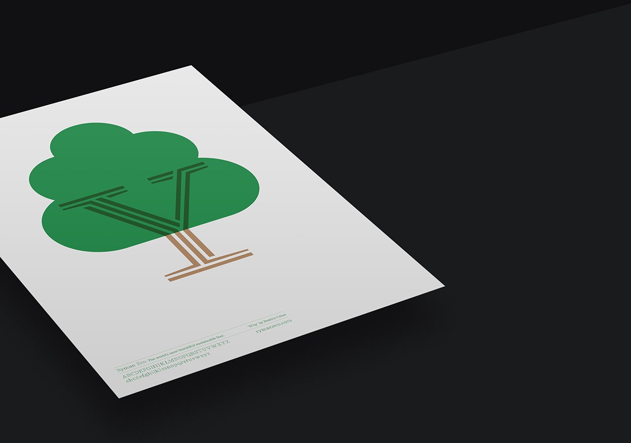
‘Why’
BY BEATRIZ COIAS
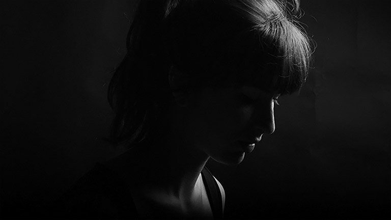
Beatriz Cóias is a portuguese graphic designer currently working in London. She’s co-founder of the design collective Studio Pyramid and has also worked with music artists, record labels and fashion designers around the world.
“The shape of the letter Y combined with the unique lines that make the Ryman Eco characters reminded me almost instantly of tree branches. With that in mind and taking advantage of the shape I’ve added a green simple form that was multiplied to give a sense of fullness. The lines in the Y were also extend in order to convey the message across and make it look more organic and less symmetric. A tree is also a symbol of life and a commonly recognisable icon for sustainability and ecology, words that can also be used to describe Ryman’s eco-friendly typeface.”


